How to Check Colour Contrast for Accessibility (WCAG Guide)
Learn the WCAG contrast ratios for text and interface parts, how to test your colours, and how to fix low-contrast designs.

Text that is hard to read excludes people with low vision, and everyone struggles in bright sunlight. The WCAG guidelines set minimum contrast ratios. The free Color Contrast Checker tests a pair of colours against them.
Quick answer
Normal text needs a ratio of at least 4.5 to 1 for level AA. Large text and interface parts such as icons and borders need 3 to 1. Level AAA asks for 7 to 1 for normal text.
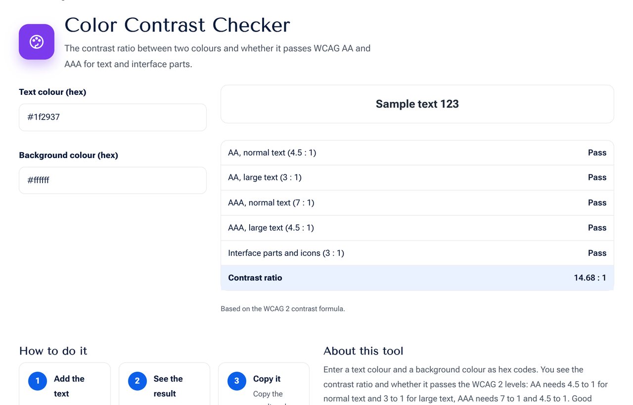 The Color Contrast Checker tool on shobfree.com, ready to use in your browser.
What counts as large text
About 24 px, or 18.7 px in bold, and above. Everything smaller is normal text.
Examples
- Black on white is 21 to 1, the maximum.
#767676is the lightest grey that passes AA on a white background.- Light grey text such as
#999on white fails, at about 2.8 to 1. - White on a pale blue button often fails. Darken the blue.
How to use the checker
- Enter the text colour and the background colour as hex codes.
- Read the ratio and the pass or fail for each level.
- If it fails, darken the text or lighten the background until it passes.
Common problems
- Placeholder text in forms that is too light.
- Text over photographs with no overlay.
- Disabled-looking links that are really active.
- Colour alone used to show an error. Add an icon or text.
Tips
- Test your main brand colours once and write down safe pairs.
- Check hover and focus states, not only the default.
- Test on a real phone outdoors.
Beyond contrast
Contrast is only one part of accessible design. Also keep text at least 16 px for body copy, use line height of about 1.5, avoid long lines of more than 80 characters and make links look like links. People with colour blindness may not tell red from green, so add a label or an icon to anything that depends on colour.
A small workflow for a design system
Pick your brand colours and test each text-on-background pair once. Record the passing pairs in your style guide, for example "primary text on white" and "white on primary button". New designers can then choose from tested pairs without checking each time.
Contrast ratios of familiar pairs
| Text | Background | Ratio | AA normal text |
|---|---|---|---|
| #000000 | #FFFFFF | 21 : 1 | Pass |
| #333333 | #FFFFFF | 12.6 : 1 | Pass |
| #767676 | #FFFFFF | 4.5 : 1 | Pass |
| #999999 | #FFFFFF | 2.8 : 1 | Fail |
| #FFFFFF | #2563EB | 5.2 : 1 | Pass |
Fixing a failing pair
Darken the text or the button by about 10 percent in lightness and test again. Keep the brand hue the same and change only the lightness with the Color Converter.
Sources and further reading
- Web Content Accessibility Guidelines (WCAG) 2.1, success criterion 1.4.3 Contrast (Minimum): w3.org/TR/WCAG21.
Frequently asked questions
Is AA legally required? In many countries public sites and some businesses must meet it. It is also good practice everywhere.
Does dark mode need checking too? Yes. Each pair of colours needs its own check.
Does the checker work for gradients? Test the lightest and darkest points of the area behind the text.
Next step
Test your colours in the Color Contrast Checker. Convert codes with the Color Converter.